05 Jun 2024
What makes a good design? Come to think of it, what inspires a good design? How do creatives craft a brand and tell the right story?
Founder and executive creative director of Intertype international design agency, Asa Cook has worked for 22 years in the design industry creating brand packaging, identity and experiential design for world famous brands such as Tanqueray, Tate and Lyle, L’Oreal, Jameson and Grey Goose.
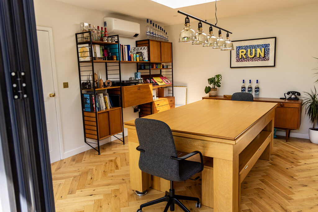
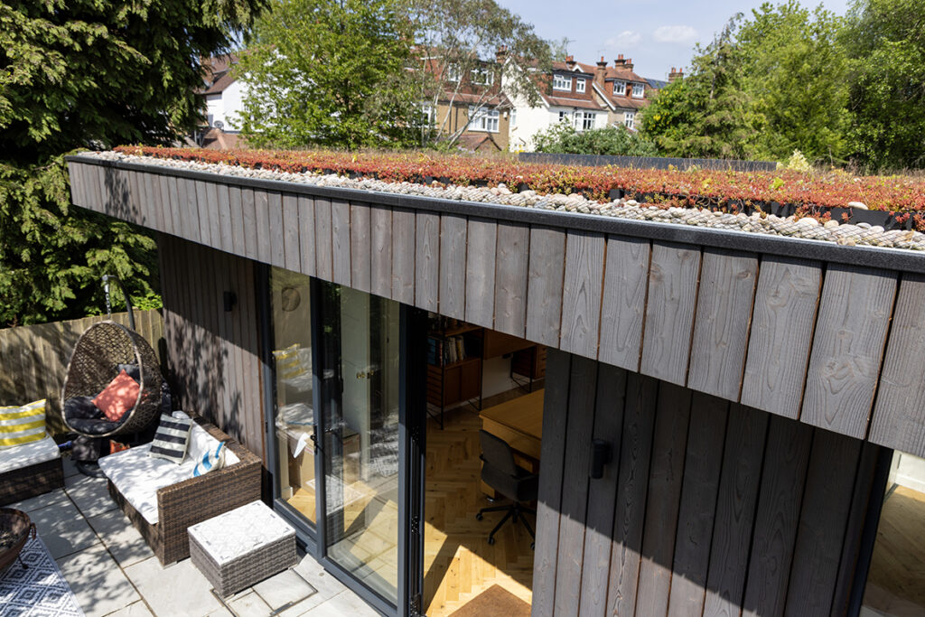
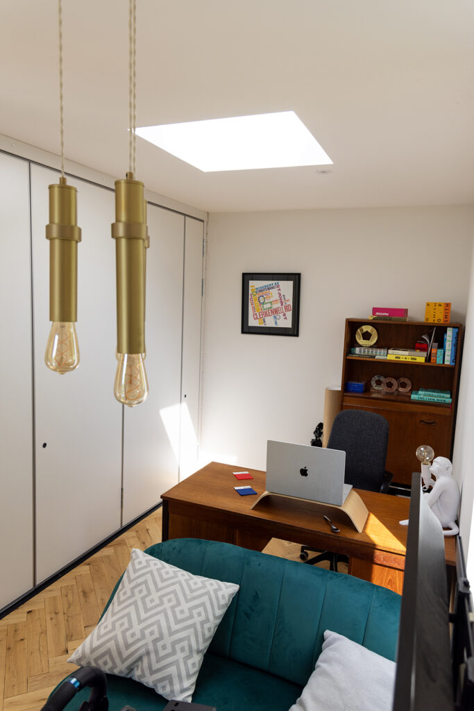
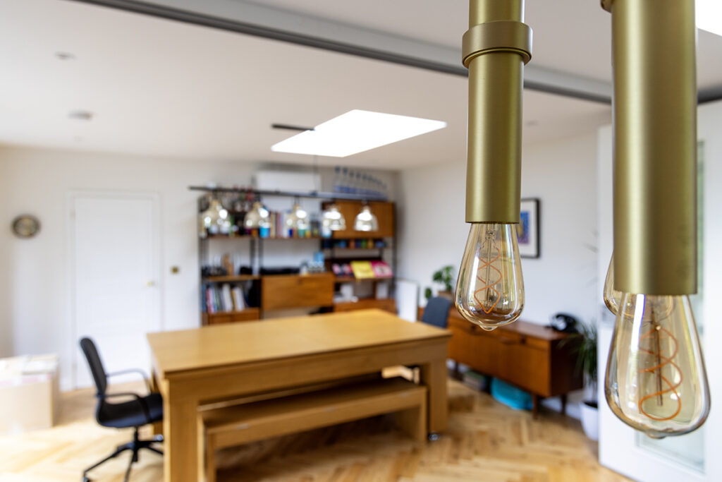
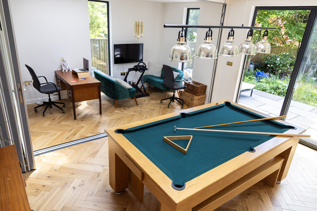
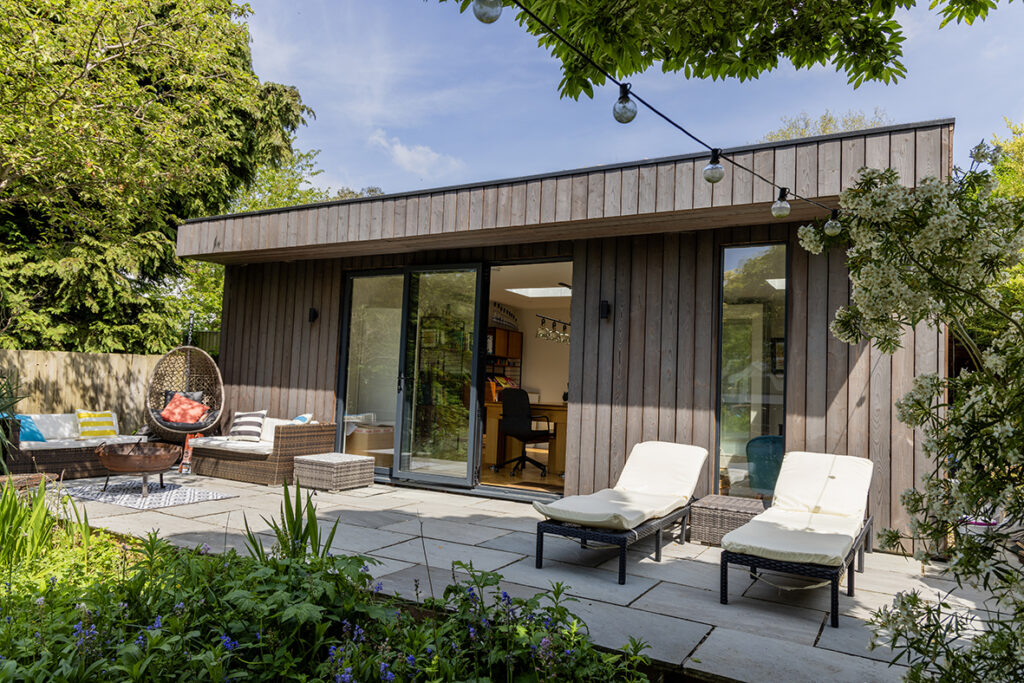
His award-winning career has taken him all around the world, but it from his garden studio on St Albans’ London Road – or sometimes in one of the city’s many coffee shops – that Asa now produces his work.
Having worked at London-based agency Design Bridge from 2002 to 2019, he had just established his own Soho-based studio when Covid kicked in and like everyone else he ended up working from home.
“It was scary but I think it actually helped us because it levelled the playing field for everyone. I’d left a massive agency with a big swanky office in Farringdon but during Covid if you had a call with the world’s biggest advertising and design companies, they were all sitting in their living rooms and working from home, so to see us doing that wasn’t strange.
“That’s why we’re a global agency working on global brands, even though the studio’s here in St Albans. That’s the one thing that put me off starting my own agency for like a decade, I wanted to work on big, famous global brands and I though, how is it possible to go from zero to that? From starting your own tiny company, it just seemed impossible. And I think Covid is the reason why it worked.”
Unable to take clients from Design Bridge as it would have been a breach of contract, Asa had another stroke of luck after a high-profile contact moved on to a different company and reached out to him personally because of their previous working relationship, which helped with initial projects to work on.
“Because I’ve worked in the industry for 20 years, I had a good reputation, a lot of contacts, and that’s the reason why we’ve been able to work for these types of companies.”
As restrictions eased he decided to build his own studio instead of returning to the capital, and thanks to establishing remote working practices it means on any typical day there might be 10 people working for Intertype, but two might be in Spain, two in south London, one in the West Country and others in St Albans.
In the company’s first two years of operation it won 11 major design awards, including the 2021 Pentawards for Best Newcomer Design Agency, a remarkable run of achievements for a start-up.
Design being a very subjective industry, where no two projects are the same, Asa says it’s impossible to offer a simple quote for any particular piece of work, as the process behind creating a design can be very different each time.
“It’s like somebody saying to you I need you to build me a house, can you let me know how much it costs? I can’t answer that question because it’s totally dependent on what kind of house it is, what scale it is at and everything.”
How then, would he design a brand of rum? What does the actual process involve?
He explained: “If the brief is, let’s redesign Bacardi, then that’s a completely different approach to inventing a brand for a start-up rum. We could do both briefs, but we’d approach them in a completely different way.
“If you’re designing for a brand that already exists, you have to really immerse yourself in that brand history and understand the story behind the brand: why it exists and why it’s successful, then you figure out which part of that story you want to tell and that inspires what the design will look like.
“For instance if you were working on Bacardi you might say: ‘OK well the roots of it are in Cuba, now what parts of Cuban history should we be representing? What art style should we be representing? Why does that tell the story of this liquid? How does it link to the occasion when the liquid is enjoyed? Like, what perception would that give someone?’
“You work all that out before you do the design. That’s the strategic part, and it then starts to design itself because you know those answers.
“With a start-up rum brand what you do is you’d figure out what story you want to tell that’s unique versus somebody like Bacardi or whoever the main players are. Like why, who’s the founder, why was it made, why is it different from other rums, where are the ingredients from, is there some point in history that you could reference that would remind people of those things?
“They say a picture tells a thousand words, well there’s a term called semiotics that means the meanings that you get from images. So, obviously you could see a picture of a tree and you can understand it means nature, but if you saw a picture of a tree and the branches were on fire, then it might mean horror. You know, or one that’s with no leaves on it would mean winter. And that’s just at the very base level.”
For designers, the ability to tap into a visual memory is crucial to the process.
“If I was designing a rum and somewhere in your visual archive you might understand what Cuban street art looks like, and then you can make that connection to the place. It may have been painted on the side of a bar, which is high energy, somewhere they serve cocktails, and you start to think ‘that’s what I would drink with my friends’, so that makes it sociable and outgoing, which are all the values you want the brand to have. So it’s not a simple answer.
“It’s about what we call the memory structures. So when you create a brand, you try and create memory structures, which gives stories about the product, where it’s from, which part of history it’s from, how it’s enjoyed, how I should drink it, why it’s good quality, and that kind of thing. And that’s what people in branding really learn and understand.
“So it seems from the outside, when you see an idea that comes along, it was just
like a light bulb moment of inspiration, but actually it’s quite a lot of thinking about the time, the place, and the attitude that a brand comes from.
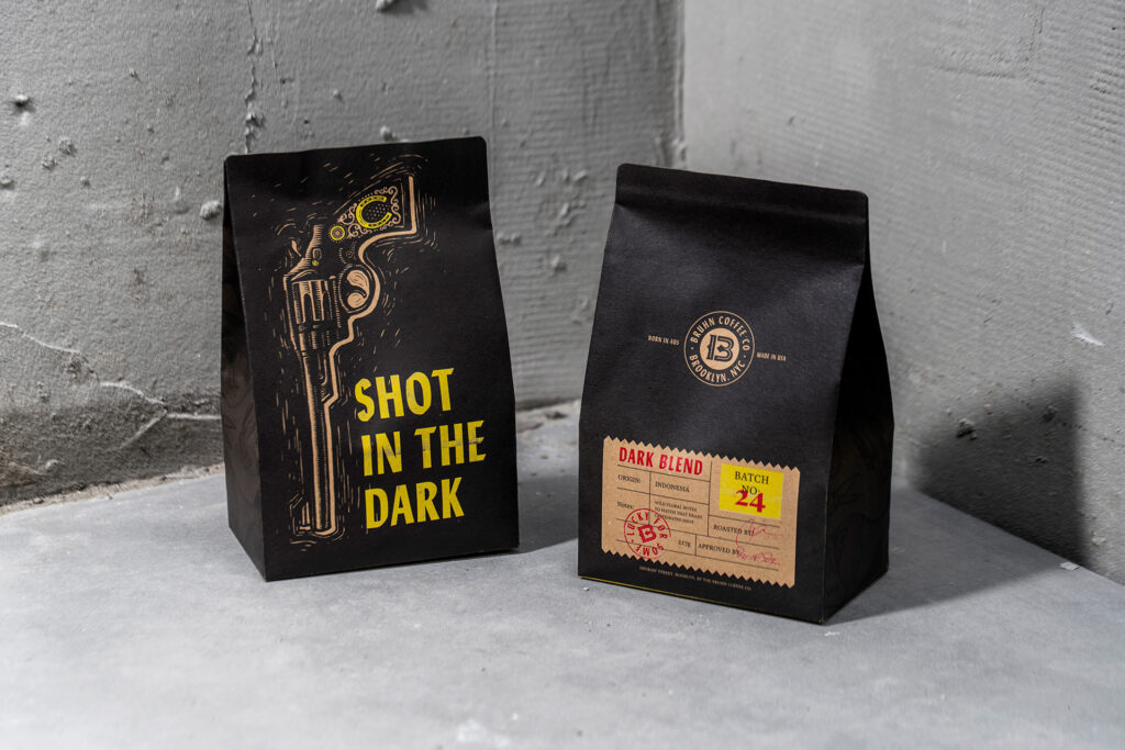
“All of our projects are examples of that. We just recently launched a coffee in Brooklyn and the story of the coffee is inspired by Brooklyn and the type of consumer that will be drinking it, but it’s also inspired by the founder and his background in Sydney, Australia and how in his family tree he had these criminal connections.
“So we drew this analogy up of the idea that, like, you’ve got to be pretty tough to survive in New York. That’s quite an exaggerated concept but day to day it’s hard work, it’s a battle for survival, it’s a battle to make progress and to earn money and that’s almost a bit like being a gangster or being a criminal.
“We connected his family background to where the product is drunk and enjoyed and then made the story all about this gangster lifestyle. Then it was the perfect analogy because some of the language around the gangster’s life and the coffee world actually overlap.”
He produces the coffee sachet, which bears an illustration of a revolver alongside the name ‘Shot in the Dark’, and a flapjack or brownie box which looks like a stack of cash. Dynamite.
For Asa, his accumulated expertise and knowledge is as much a part of the process as the design itself: “A famous designer called Paula Scher who lives in New York and works for a place called Pentagram once said :‘I could do a drawing that takes 30 seconds that solves your problem but it’s taken me a lifetime to learn how to do that drawing in 30 seconds.
“She designed the Citibank logo in like 30 seconds, but to them it’s got a value of millions.”
He himself has found inspiration in the most unusual of places, including a piece of Tarmac and a half-eaten bagel: “All people have a visual library in their heads, but designers just have a really more highly tuned one. They’re looking at everything all the time, but they’re looking at it so much that it’s completely exhausting.
“If I go into a supermarket, it’s a struggle, because I have to look at every bit of typography, every illustration. I have to think about why that was chosen, how that represents the concept and the story that they’re telling, and things like that. It’s hard work.
“It’s the same, in like an art gallery or something, you don’t just look at something and go, ‘oh, that looks nice’. You’re thinking, well, what are they trying to say? Why did they do that? What did that mean at the time? How could I use that style one day in another context to symbolise that time period or that way of thinking or something like that?
“You’re kind of bombarding yourself with visual content and visual stories and then archiving them in your mind. Then they kind of ferment and brew and then one day they come back out.
“When I was a student, I met somebody who told me that. I was thinking, really?
“He gave me an example: one day he noticed that a croissant looks exactly like a crab and said he knew that one day he might need that.
“Later on in life he got a brief to design a bakery by the seaside in Cornwall somewhere and created a logo which was a croissant that looked like a crab.
“He said that’s what you need to do as a creative, you need to continually feed your brain and one day it will be useful. It sounds very deep, but it’s not.”

What sort of designs jump out at him in St Albans?
“I’m always looking about what people are trying to say.
“So for instance, Brad and Dills is the new coffee shop on London Road, and they’ve deliberately kept the signage from the old laundry, and it says BAD coffee on the sign and the wi-fi is BAD St Albans and stuff like that.
“I think they’ve done a really good job because they’re telling their own and it’s obvious they’re assuming a lot of intelligence on the part of their customers, because the customers aren’t going, ‘oh, the coffee’s really bad’, really. So there’s clever branding around.
“Then you see some chain brands and sometimes their behaviour is great but sometimes it’s not great.
“I was in Itsu the other day and there was a bit where you get like your fork and a sign that says something like ‘I’m made of recycled cardboard’.
“I was thinking ‘Why is the fork talking? Why has this floor got its own voice?’
“I know that’s kind of a trend, but I thought it’s just lazy because they’ve just taken the trend and applied it to this random object and none of the other communication in the store was talking as if it was an object.
“Sometimes things are just badly thought through, don’t make any sense and are annoying!”
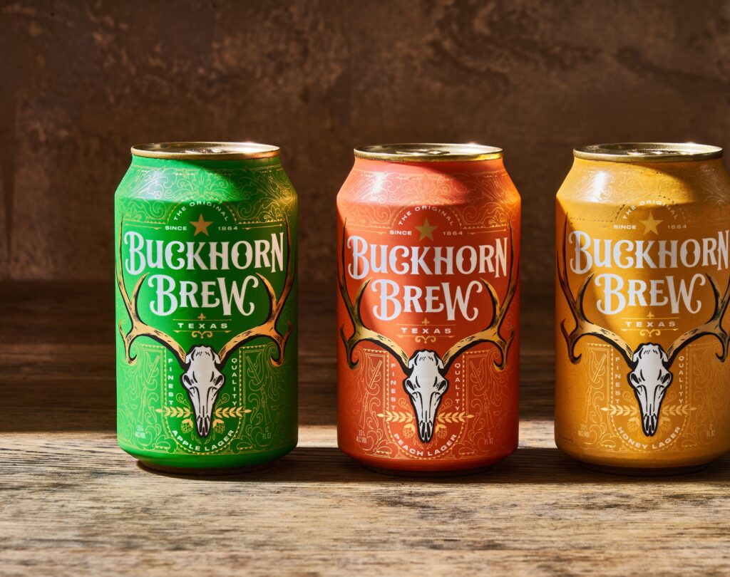
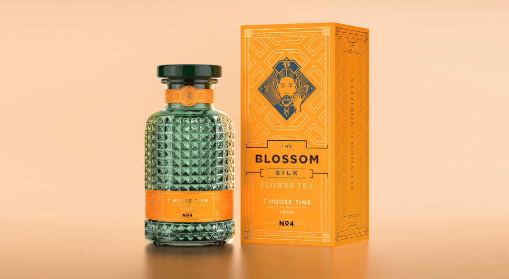
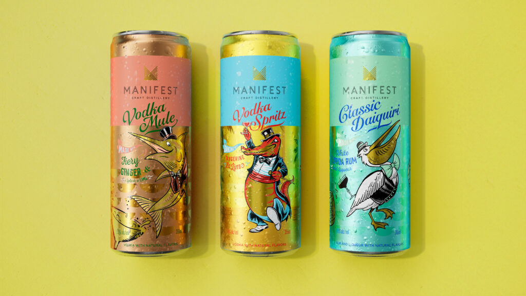
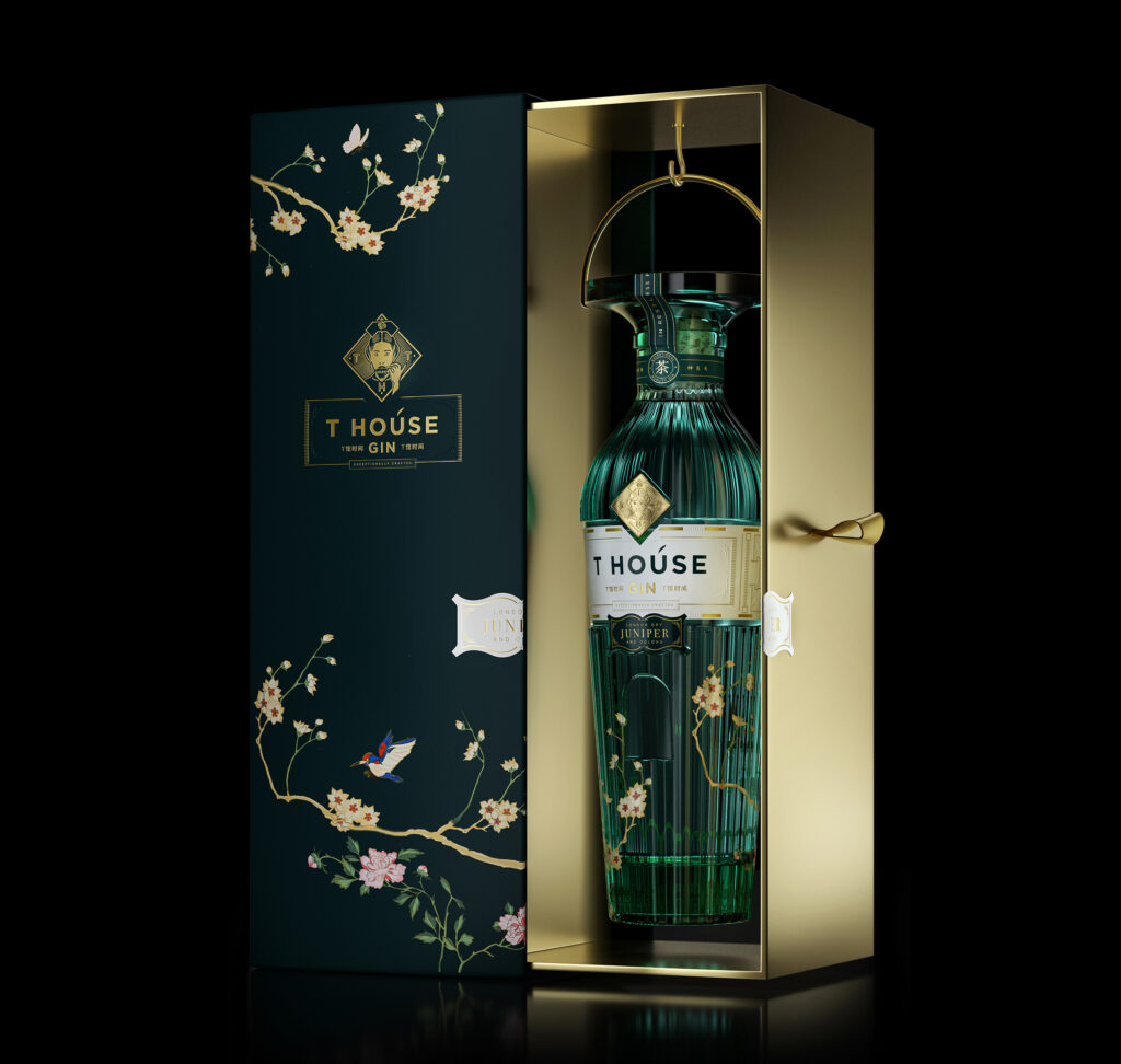
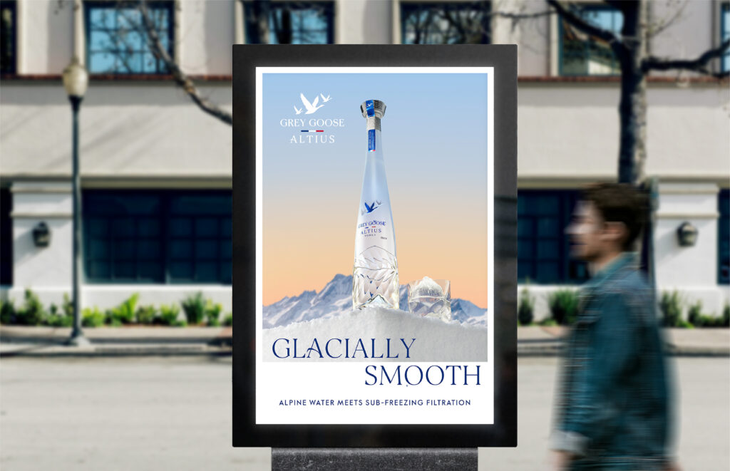
A lot of his work has involved alcohol, including designs for Grey Goose, Smirnoff and T House Gin.
Is there a reason why this field has proved attractive?
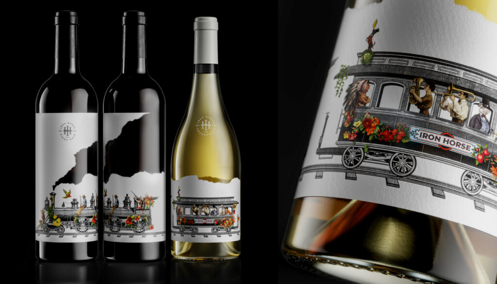
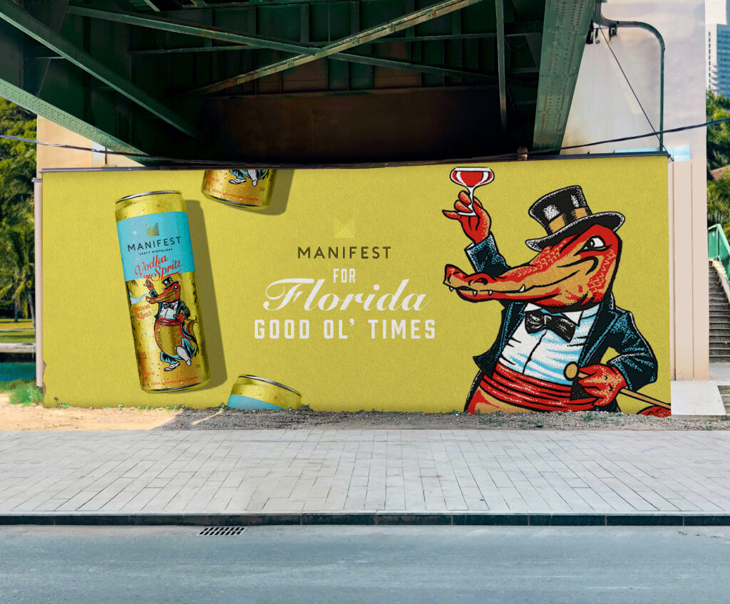
“I really like working in alcohol because people take the time to appreciate it and consider it, so the people who are making the products put a lot of effort into creating them.
“It’s just about visual impact and not as much about in-depth storytelling.
Asa moved to St Albans from Islington in around 2009, like many people with the intention of having kids and raising them in a safe area. As well as home, it’s also somewhere he’s designed many different projects in the city’s coffee shops.
“I’ll go and sit in coffee shops and work. One project was designed in Gails, sitting there drawing the whole thing out.. I find that if I’m sitting there and there’s background noise, it helps me focus weirdly. You know how people like to have the radio on in the background, well if I can hear chatter I feel like I’m in a crowded workplace and then I can block it all out and get really into a zone and I’m much more productive.
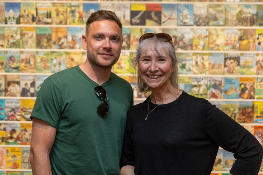
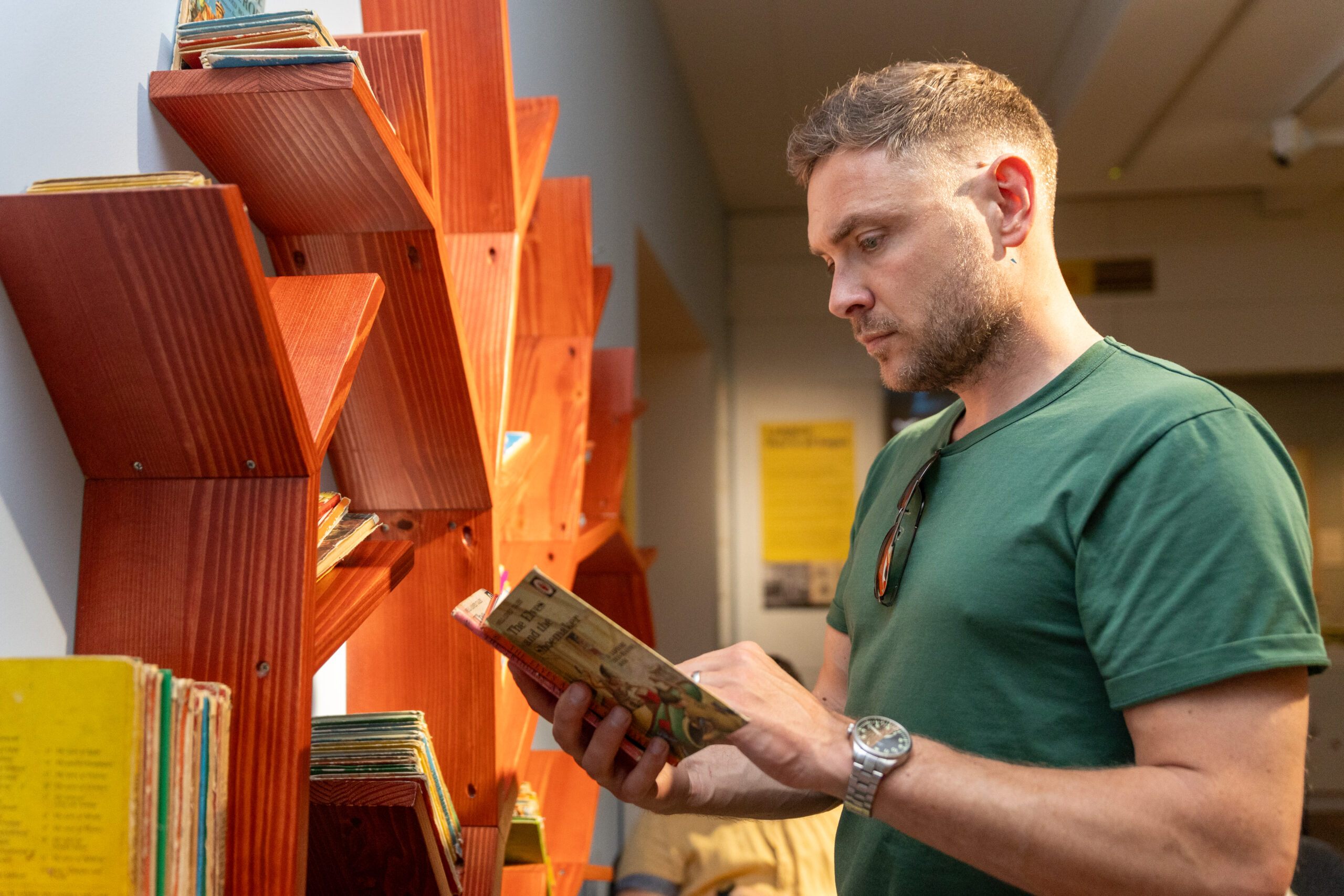
He recently took the time to explore The Wonderful World of the Ladybird Artists at St Albans Museum + Gallery, the exhibition looking at the creatives behind the children’s classics.
What did he make of it?
“The exhibition feels incredibly relevant as we enter a new dawn of AI-generated design and I’m especially excited to see a collection of design work from an era when the role of a commercial artist was to create beauty, storytelling and build emotional connections using expertly hand crafted techniques.
“We live in an age where we are bombarded with imagery that is created by machine with no real emotion behind
its creation, and we long for the nostalgic sense of warmth and comfort found in the creativity of our childhoods. As our attention spans shorten and we increasingly withdraw into the tiny, phone shaped space of the digital world, I encourage people to attend this exhibition to simply spend time with the beauty of the work and to reconnect with the physical environment.
“Allow yourself the headspace to absorb these iconic creations and experience the feelings that surface. This exhibition is design as therapy in an uncertain and anxious world. A picture doesn’t just tell a thousand words, it evokes a thousand subconscious emotions.”